One place for every bank offer, built for every client
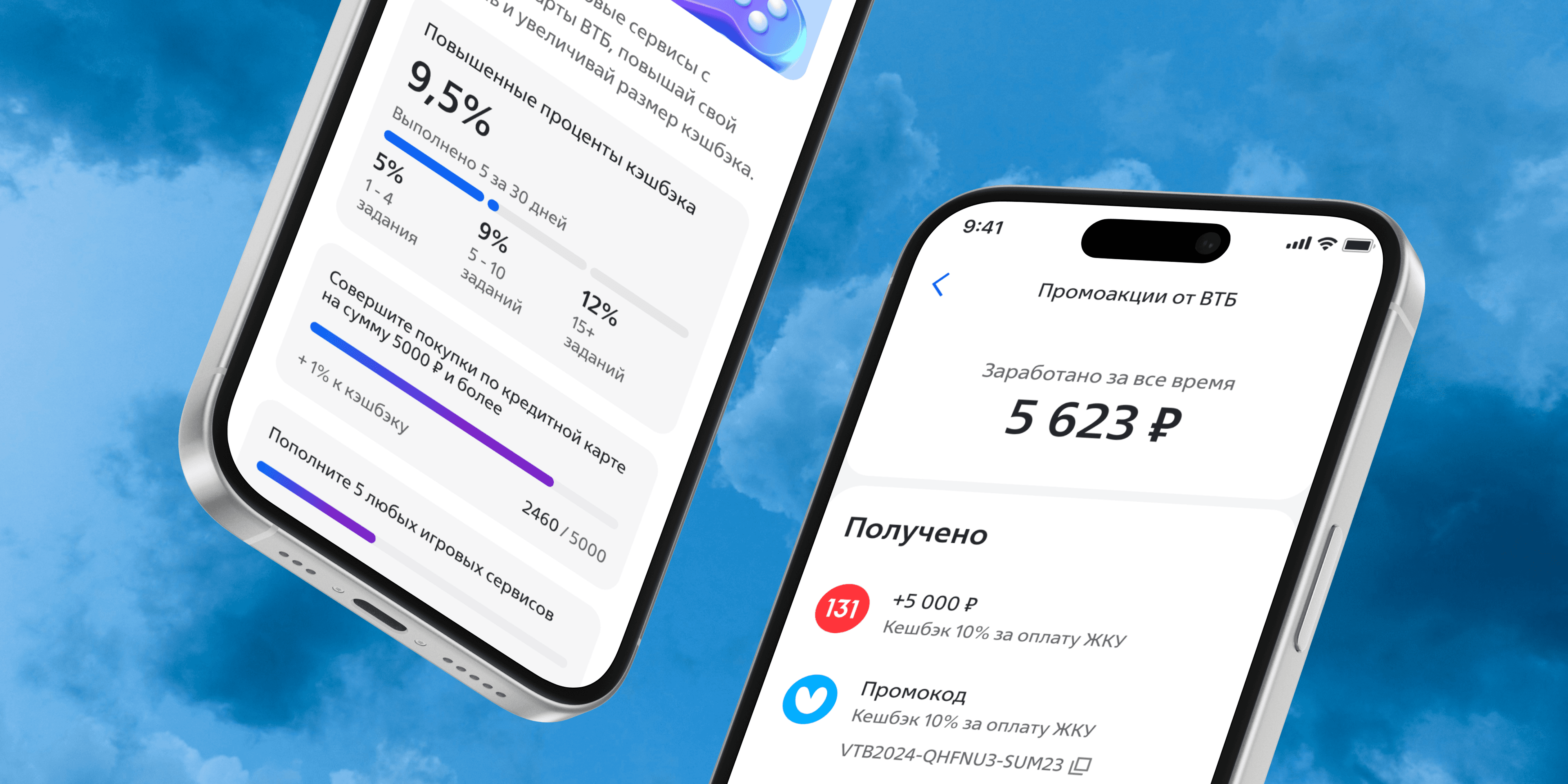
The bank's promotions were scattered across banners, pushes and landing pages. Clients missed real benefits, and the bank missed loyalty, cross-sell and partner revenue. I designed one promotions section for the mobile app, from the promo structure to every card state.
Role: Product designer
- New users per month
- +16,000
- Stable card CTR
- 5.75%
- Avg. time in section
- ~25 sec
Problem
Clarity mattered more than personalization
Competitors had loyalty sections and the bank had nothing to answer with. Clients had no way to find offers or track the ones they joined. The hard part was the audience. The section had to work for a teenager checking the app daily and for a retiree who opens it twice a month.
I ran a competitor review, a survey and in-depth interviews. Users wanted to read the benefit, terms and how to get it in seconds. Personal offers mattered less than expected. Category ranked last, which saved us from building filters for the MVP.
Key decisions
Design the data before the screens
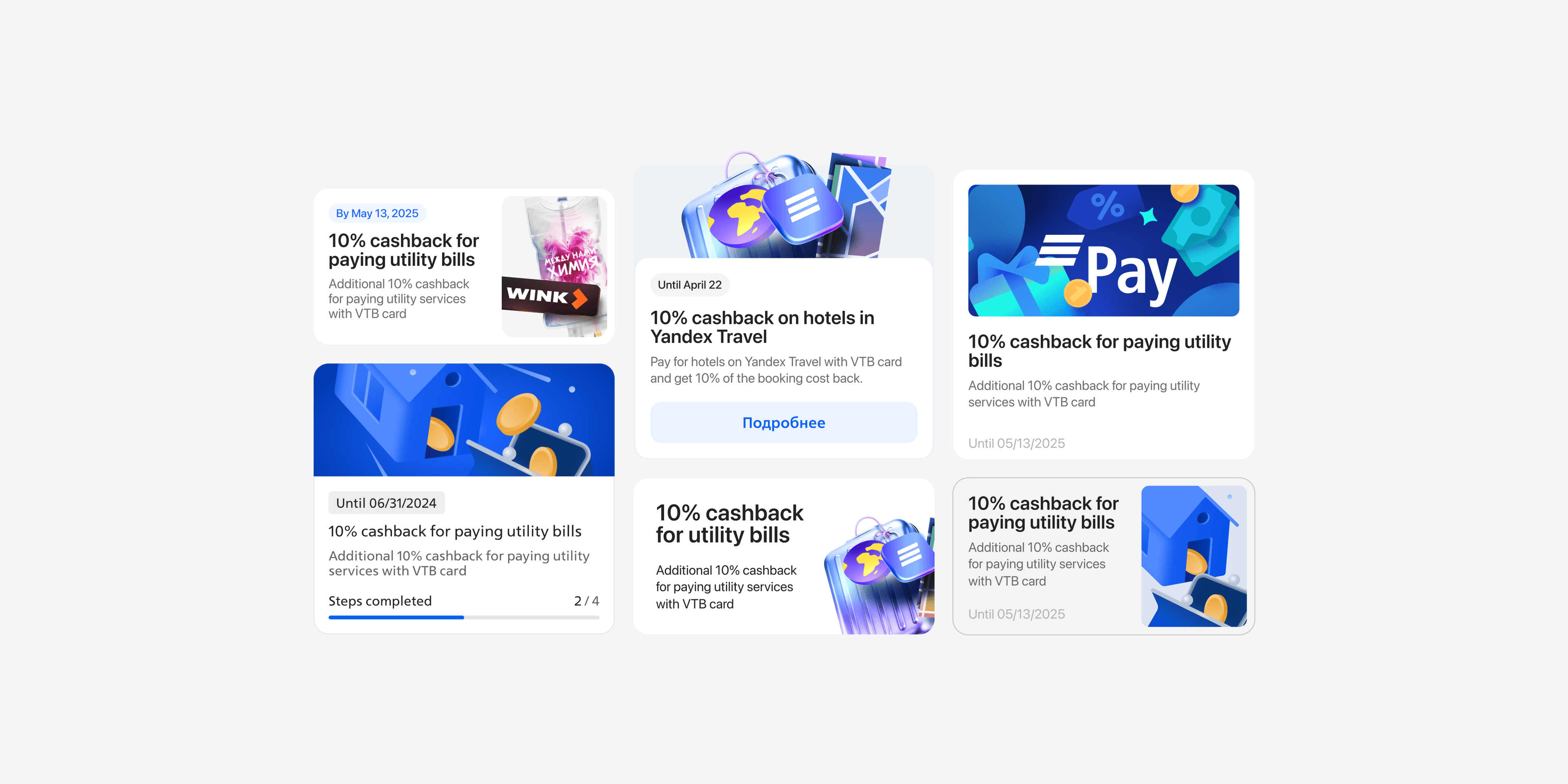
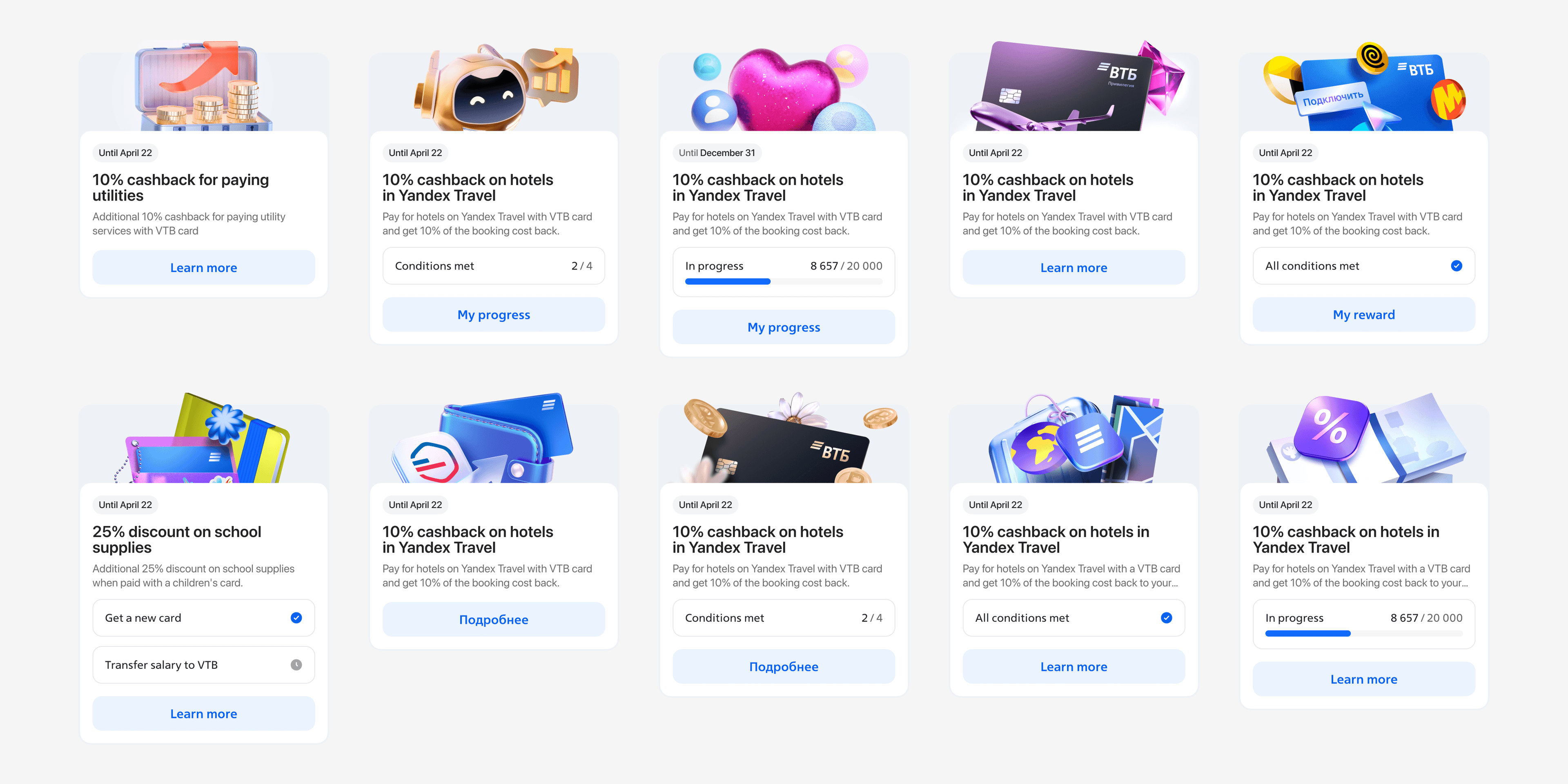
With the analyst and the lead, I defined the promo model first. A promo is simple, one action, or complex, several actions combined. Actions can be conditional, time-based, cumulative or spending-based. The card became a projection of that model, so new promo types don't need a redesign.
Let the A/B test pick the card
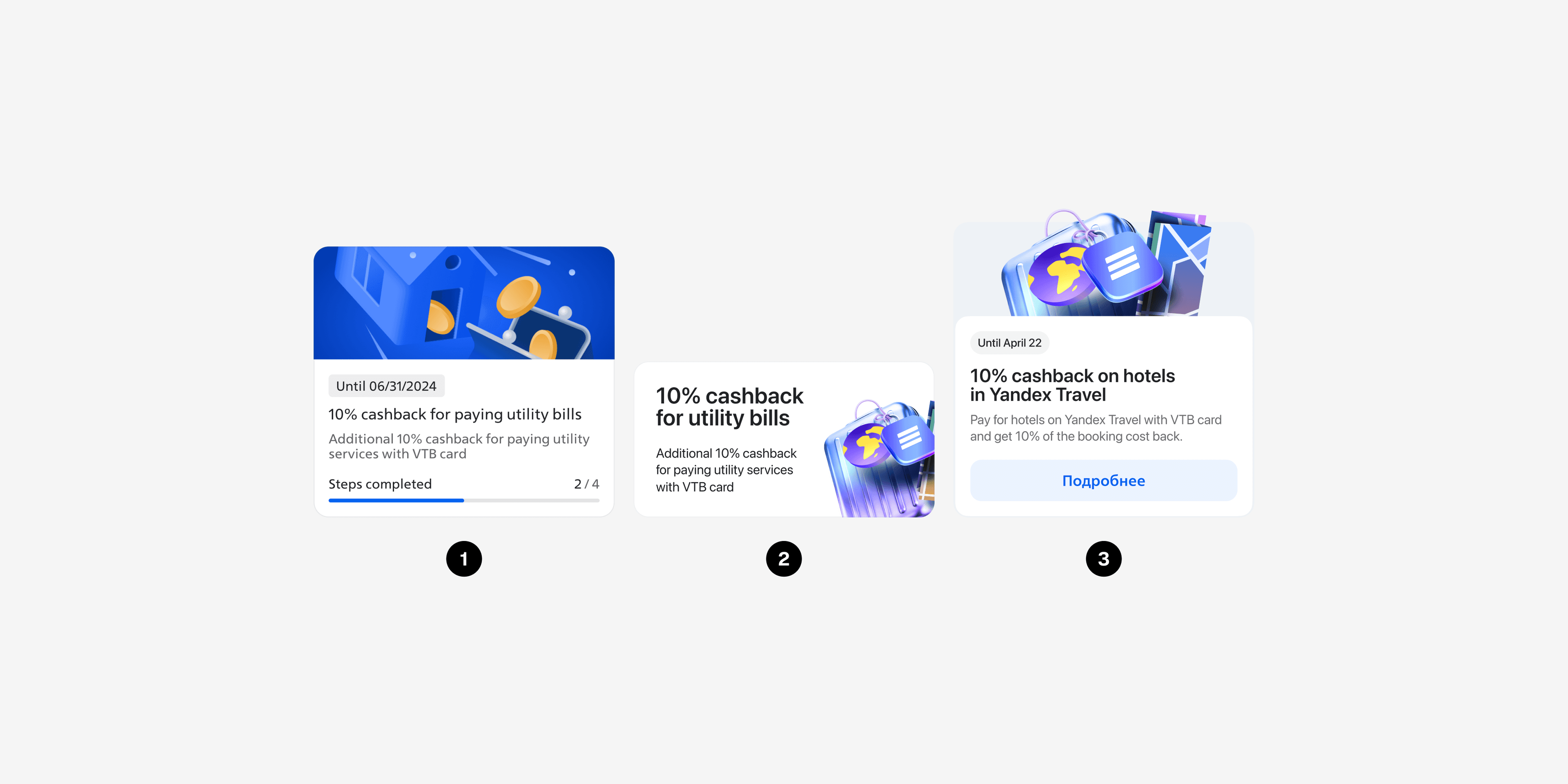
I designed three cards on one structure. The visual one looked good but hid the benefit. The text one was clear but flat in a feed. The balanced one kept a strong visual with the benefit and deadline readable at a glance. It won on clarity and scannability and went to production.
Design every state, not just the happy path
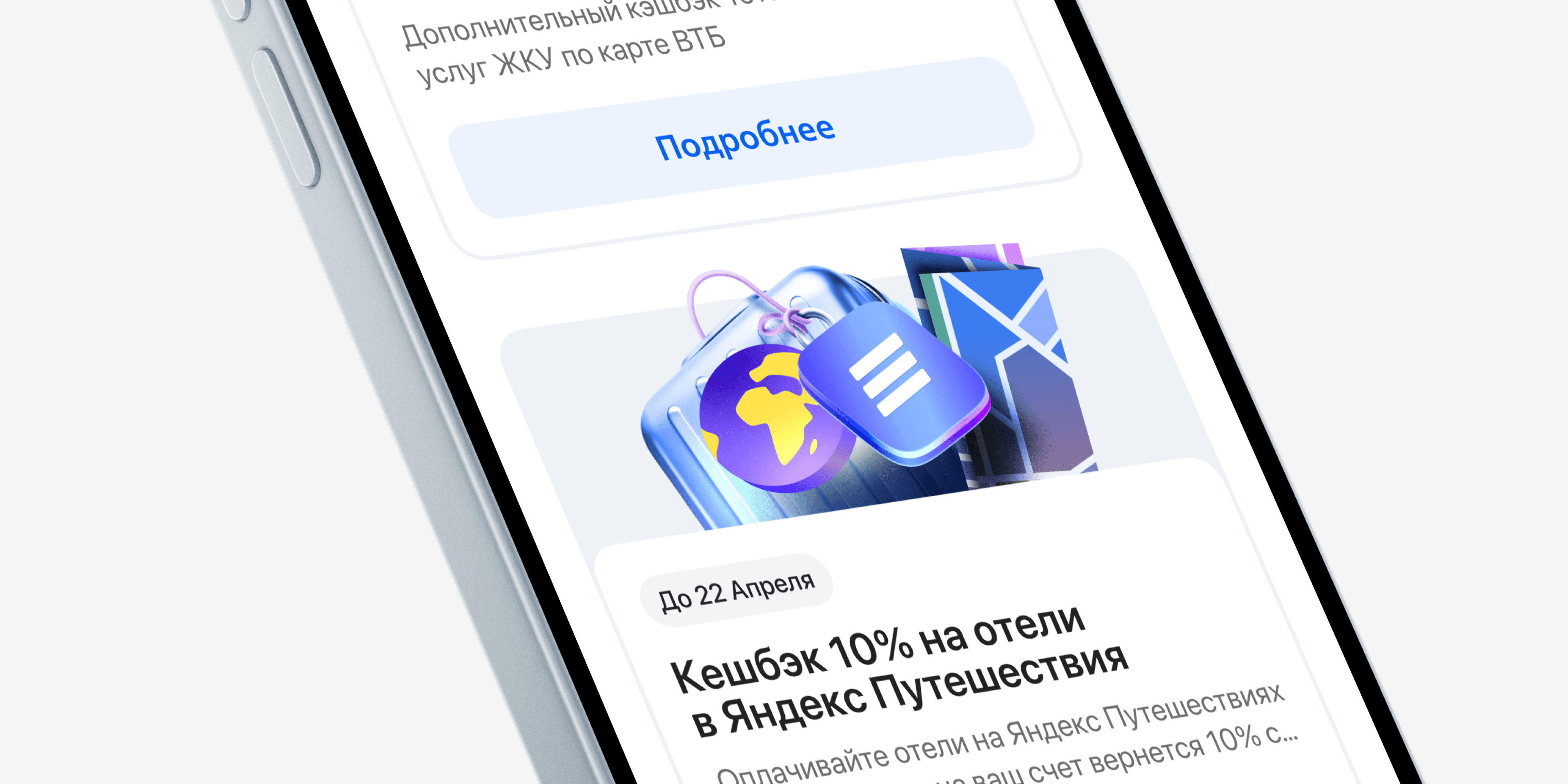
A promo can be not accepted, accepted or in progress, and complex promos multiply those states fast. I mapped all of them before handoff, because unmapped states are where bugs come from.
Outcome
The MVP beat its target in the first month. New users grew by 16,000 a month and cards held a stable 5.75% CTR. Around 25 seconds in the section became the baseline for the next iterations.
What's next
Connect the section to the bank's central loyalty system, add more partner offers, and build the two things users asked for in interviews. A participation history and one view of total benefits.