Promotions & special offers for a major bank
A central section in the banking app where clients find all promos from the bank and its partners, designed from research to A/B-tested release
The bank had no single place where clients could see its promotions and partner offers. Promos were scattered across banners, push notifications, and landing pages. Clients missed real benefits, and the bank missed loyalty, cross-sell, and partnership revenue.
I designed a central promotions section for the mobile app: the card system, the promo structure, all screens and states. The scope was an MVP, but the architecture was laid out for scaling from day one.
My role was product designer, working together with a design lead, a product analyst, and a front-end developer.
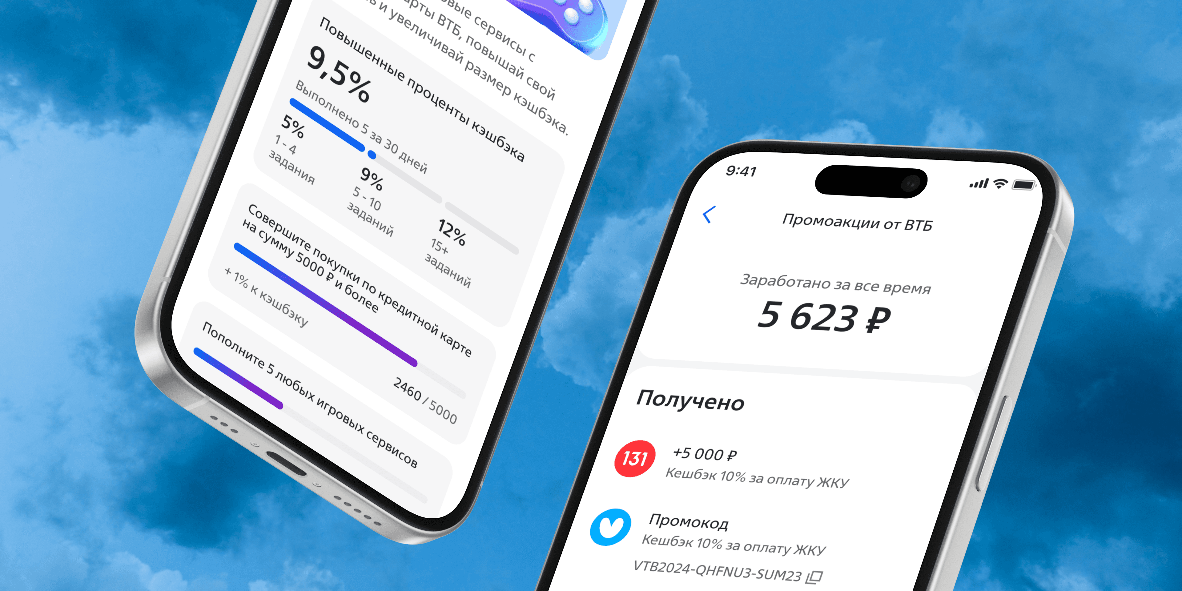
The problem
For the business: low engagement with anything beyond basic transactions, missed cross-sell opportunities, and no way to monetize partnerships. Competitors already had loyalty sections, and the bank had nothing to answer with.
For users: no convenient access to profitable offers and no way to track the promos they already joined.
The main constraint was the audience. The bank serves everyone from teenagers to the elderly, so the section had to work for a user who checks the app daily and for one who opens it twice a month.
Research
Before drawing anything, I ran three studies. A competitor analysis of banking and fintech apps to map existing patterns, offer types, and participation mechanics. A survey of a client segment to rank which information on a promo card actually matters. And a series of in-depth interviews to get at the motivations and pain points the survey couldn't reach.
The findings shaped every decision after:
Clarity beats everything. Users want to read the benefit, the terms, and how to get it in seconds. Personalization turned out to be less critical than expected — people join general and personal promos equally. Activation must be simple and transparent, with no hidden mechanics. And users care who the offer is from: a bank promo and a partner promo carry different levels of trust, so the source has to be visible.
Interviews also surfaced two things nobody asked for in the survey: access to participation history (especially when the reward is a promo code) and a single personal account collecting total benefits across all promos.
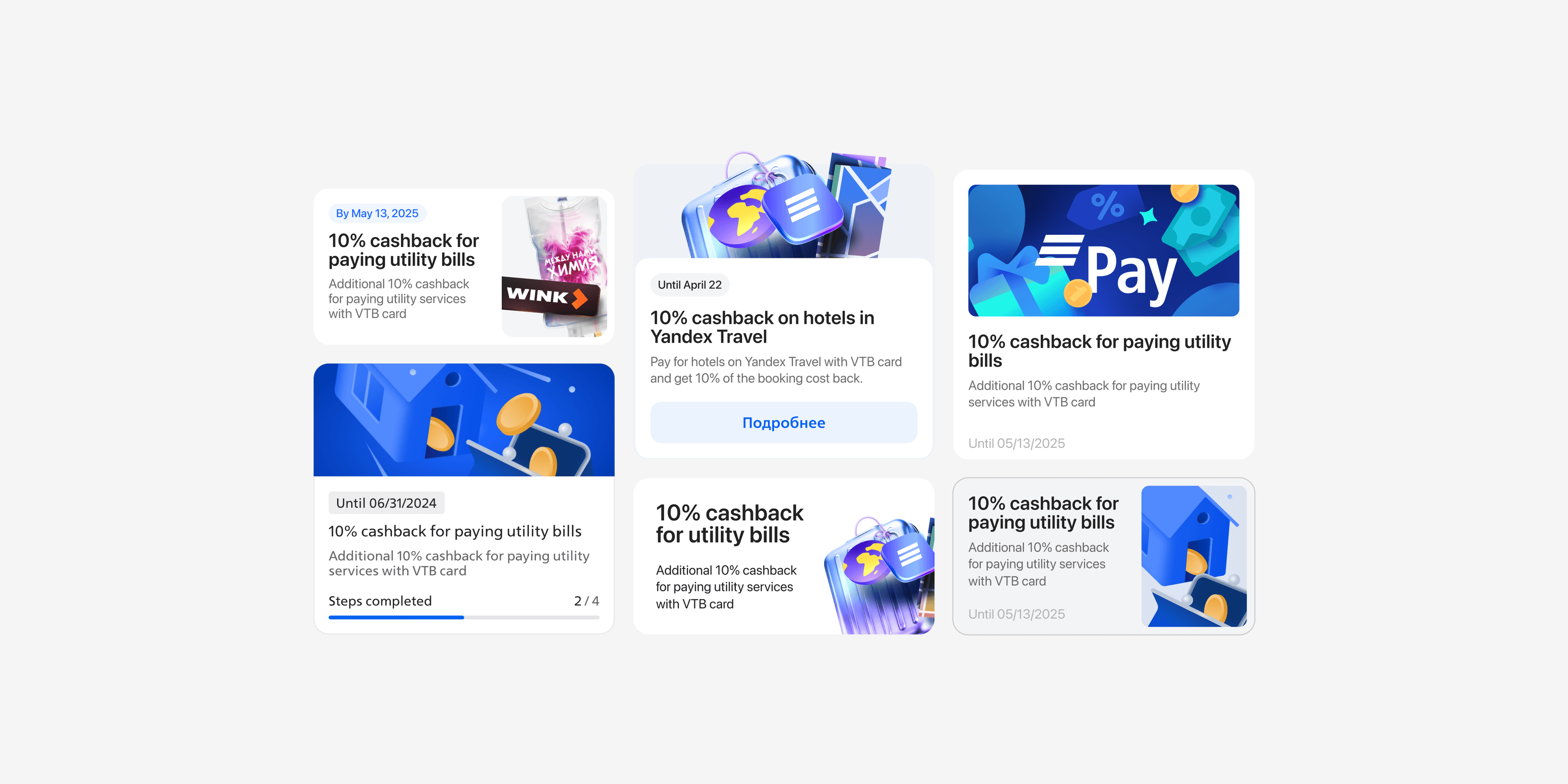
Ranking the card elements gave a clear hierarchy: the benefit headline and end date matter most, then the key visual, short description, and activation status. The partner logo and source sit in the middle. Category matters least — which later saved us from over-investing in a filtering system for the MVP.
Promo structure
Together with the analyst and the team lead, I defined the data structure before the interface. Every promo is either simple or complex. A simple promo contains one action. A complex promo combines two or more simple ones. Actions have properties: conditional, time-based, cumulative, spending-based.
This sounds like backend work, and partly it was. But defining the structure first meant the card design could handle any future promo type without a redesign. The interface became a projection of the model, not a set of hand-drawn special cases.
Card design and A/B testing
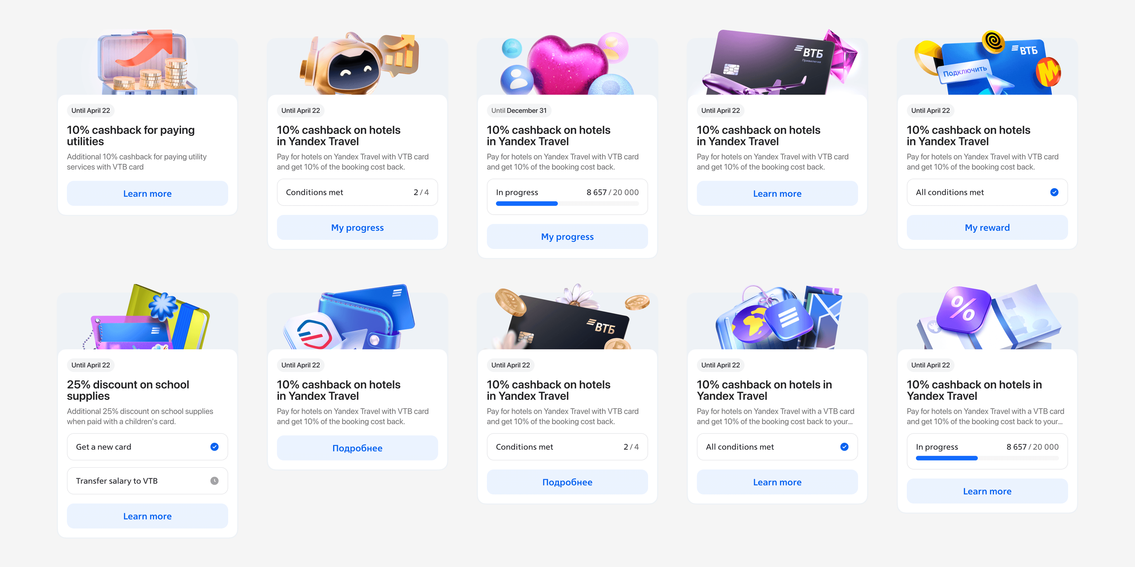
The card is the core unit of the whole section, so most of the design effort went there. The principles came straight from research: benefit-first typography hierarchy, visible end date, clear activation state, and enough breathing room to scan a long list quickly.
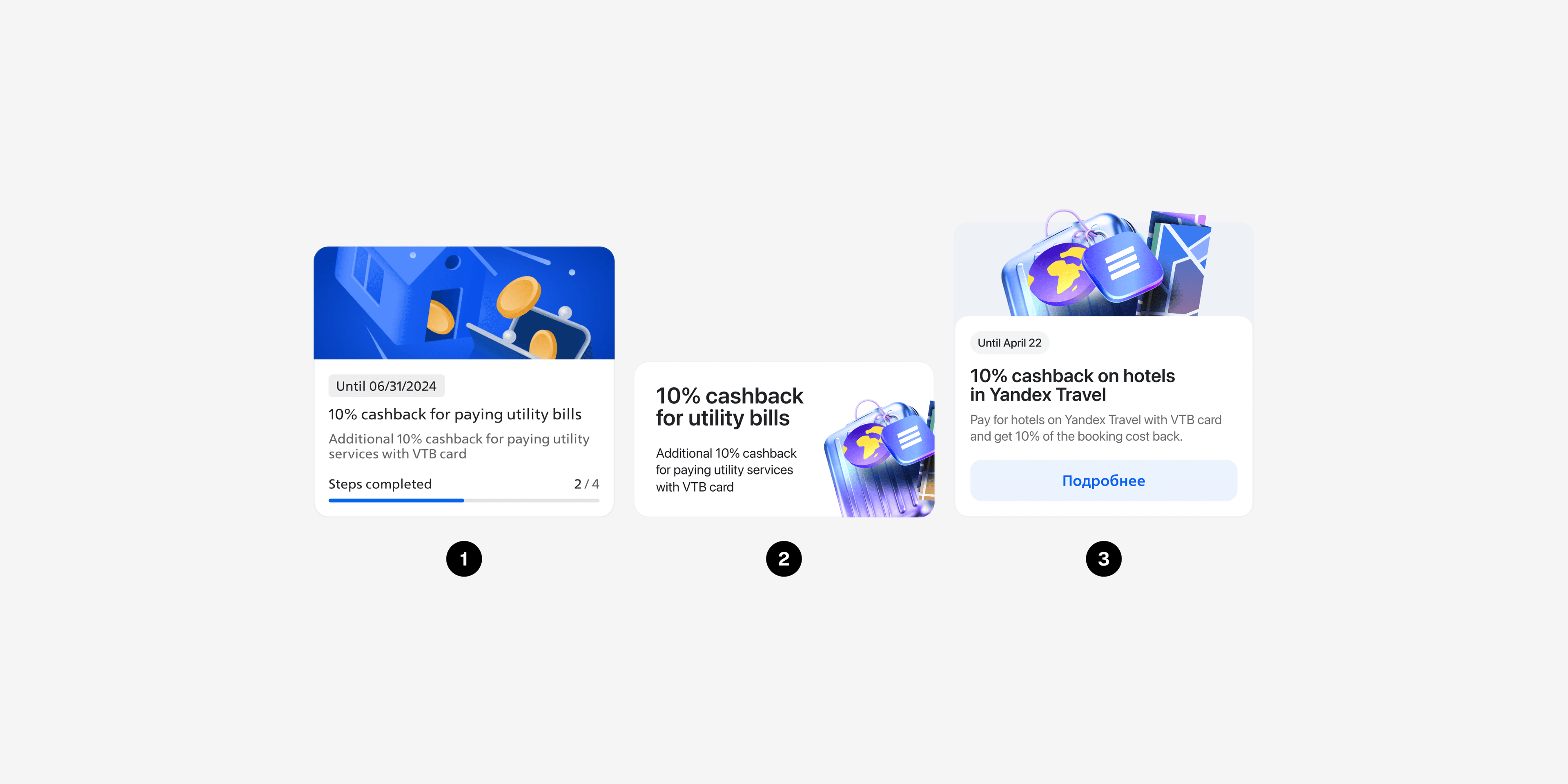
I designed three card variants on the same structure and we ran an A/B test. The first was visual-heavy and looked attractive but hid the benefit. The second was text-first — very clear, but flat and hard to scan in a feed. The third balanced both: a strong visual with the benefit and deadline readable at a glance.
The third variant won on clarity and list scannability while staying attractive, and it matched the principles we set at the start. It went into production.
States and edge cases
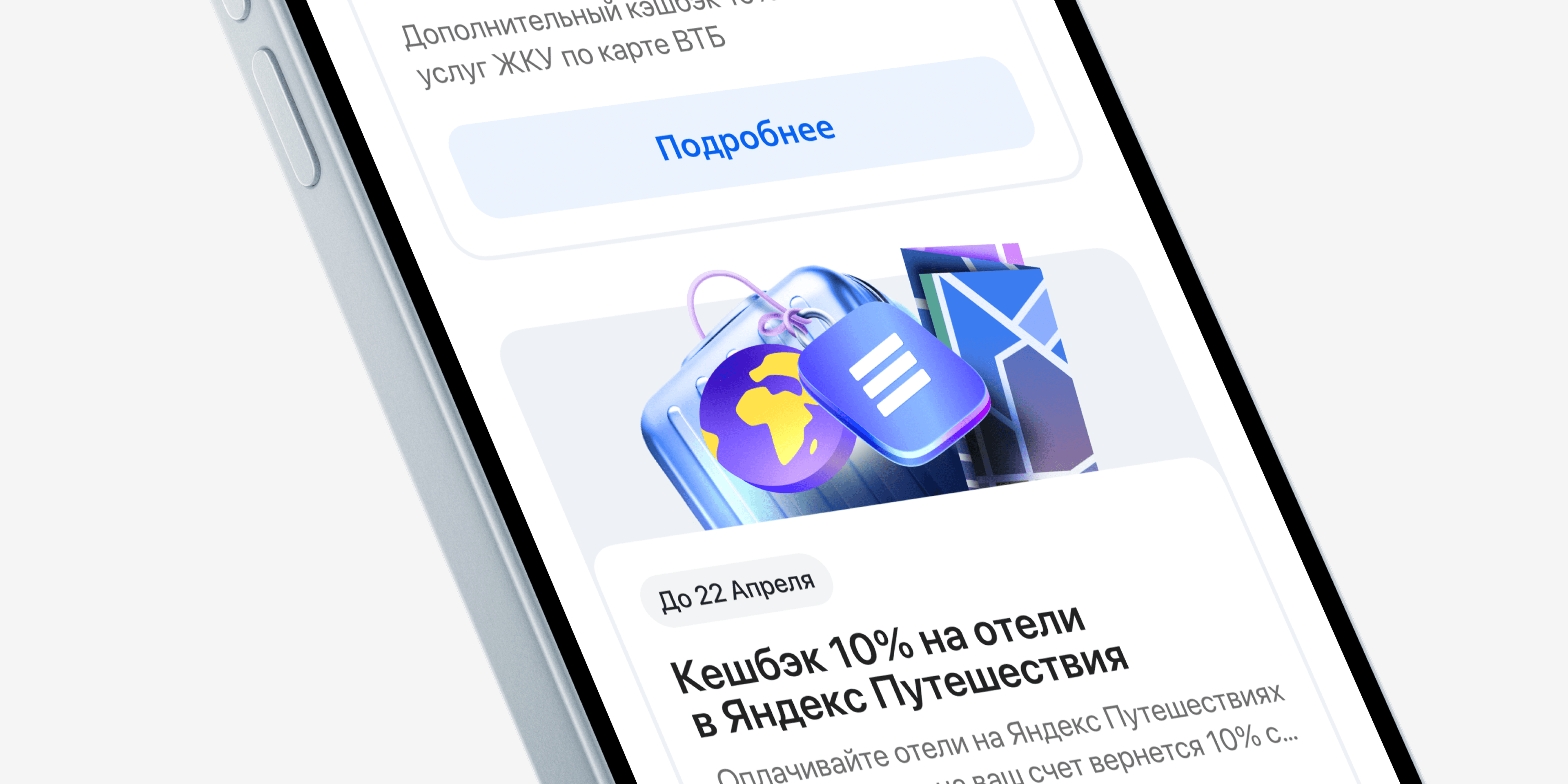
After the card was locked, I designed the full state map: a promo can be not accepted, accepted, or in progress, and each state changes what the card shows and what the user can do. Add the complex promos with multiple actions inside, and the state matrix grows fast — this was the least glamorous and most important part of the work, because these are exactly the screens that turn into bugs when nobody designs them.
Results after one month
The MVP shipped and the numbers came in better than the target. Monthly new user growth increased by 16,000 people. The cards held a stable 5.75% CTR — the benefit-first structure did its job. Average time in the section was around 25 seconds, which is expected for a brand-new surface and became our baseline for the next iterations.
What's next
The section was built to grow. The plan after MVP: connect it to the bank's central loyalty system, expand partner offers, and add the personal account with total benefits and participation history that users asked for in interviews.
The main takeaway from this project is simple. When the audience is this wide, clarity is not one of the qualities — it is the whole product. Every decision that survived testing was the one that made the benefit easier to read.